Beginners: The Basics of Watercolor Paints Part I

 Knowing how watercolor paints are classified, and how the colors appear on paper and differ among manufacturers, is the critical first step for any watercolor artist. Here’s what you need to know.
by Christopher Willard
When it comes to watercolor paints and her students, New Jersey-based artist and teacher Peggy Dressel has seen it all.
“Some arrive at class with a set of prepackaged watercolors provided by a paint manufacturer,” she observes. “Others may hold a list provided by an instructor, but they have no idea why certain colors are included.” Still others, some teachers report, ask for the names of the reddest red, the bluest blue, and the yellowest yellow, with the goal of buying the fewest paints possible. These newcomers to watercolor assume that by adding black to three good primaries they can obtain a full range of color—just like their color printers. Although in theory this may make sense, in reality it can only lead to disappointment and frustration. Here, Dressel explains what every artist should know about watercolor paints.
Opaque, Transparent, Granulating
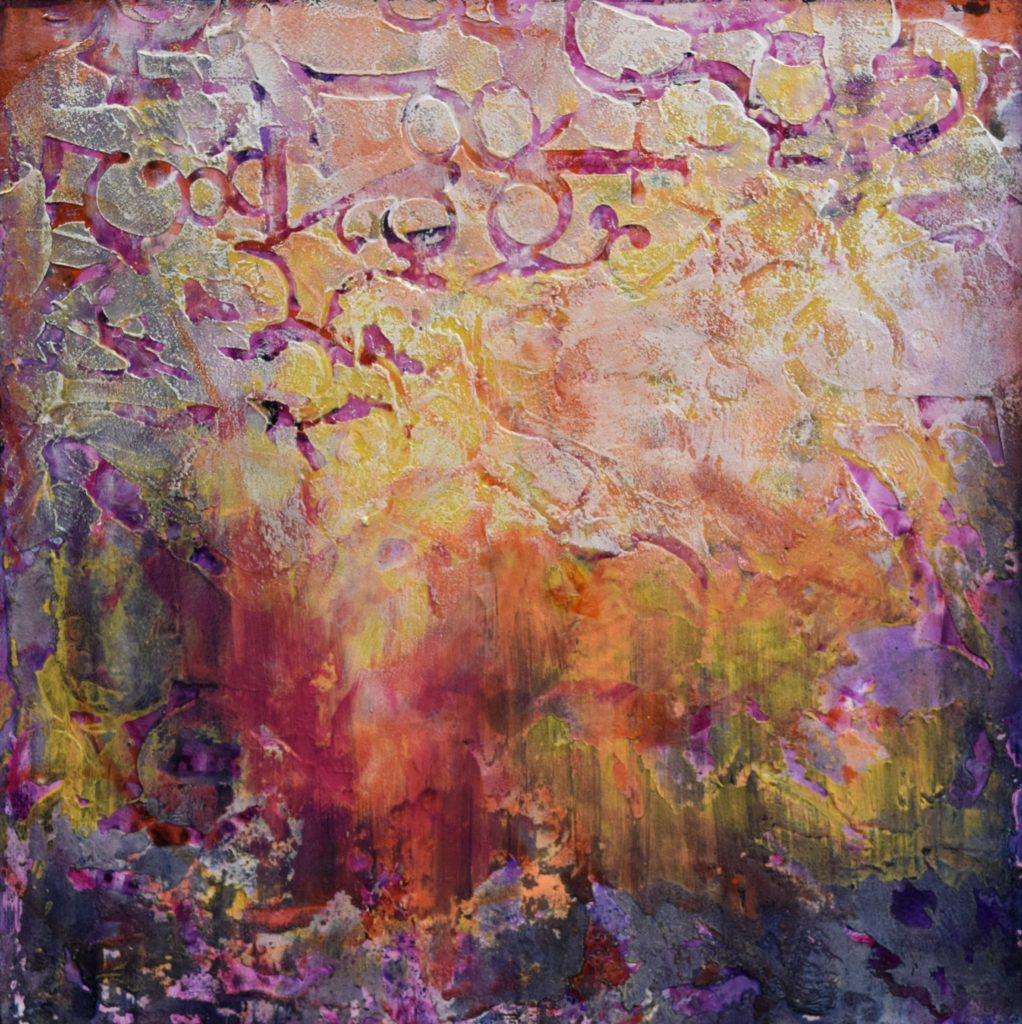
Watercolor paints vary widely in their formulations, so it’s important to experiment with different brands to find the paints you prefer. Manufacturers generally classify the paints as either transparent or opaque. Transparent paints are created by mixing pigment with a transparent binder and a wetting agent. When applied to paper, much of the reflective white surface shines through. Opaque paints, on the other hand, dry to various degrees of opacity because of the addition of chalk. Some pigments, such as certain earth colors, leave particles behind on the painting surface and are therefore referred to as granulating pigments. Although most of Dressel’s palette consists of transparent paints, she notes the importance of having a few opaque earth tones on the palette: “I sometimes play translucent and lighter colors against the more opaque colors. For example, I can make the water in a landscape painting glow more if I play it against rocks and trees painted with more opaque paints.”![]()
Tubes or Pans?
Watercolors are sold both in tube form and as dry pan paints, both individually and in kits. Tube colors are popular with professional watercolorists because the artist can squeeze as much or as little color as desired. Because the paints come out of the tube wet, they make it easy to create even washes. Pan kits are often the choice of seasoned travelers who appreciate the lack of set-up time, the way the colors remain ordered, and the ease of replacing a single pan as necessary. The drawback to pan paints is that the artist must add water to each pan while painting, and it is often more laborious to mix a large, even wash. 
No Perfect Colors
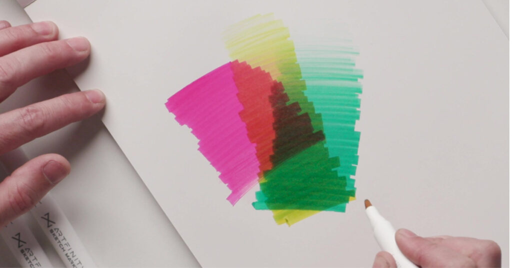
Dressel tells her students that the entire process of selecting a palette is governed by one important rule: There are no perfect tube colors. Although every hue available possesses a dominant hue, each is tinged by another color. Either the pigment strongly reflects light in a second part of the spectrum or the paint is a mixture of more than one pigment. Sometimes this tinge of the second color is visible to the eye. Other times the tinge is not so easily seen, such as the purple-red quality of French ultramarine.
When artists select and mix two primaries without considering the colors that tinge them, they often end up with a subtle, beautiful, desaturated hue—also known as “mud.” For instance, mixing French ultramarine with a cadmium yellow medium presents a problem for many new artists, because often the mixture is less than a vibrant green.
Warm vs. Cool
When artists refer to warm or cool colors, they are looking at the color tinges. A warm yellow is often tinged with red, while a cool yellow is often tinged with a touch of blue, which produces a slightly greenish look. In general, warmer colors contain yellow, orange, or red, while cool colors are tinged with green, blue, or violet. Knowing exactly what that color tinge is rather than relying upon the vague terms warm and cool is important when mixing for vibrancy. Some may call a blue cool if it includes a dark tinge, but this dark could be a green or violet. Each would mix differently.
Good-Quality Paint Makes a Difference
Creating vibrant watercolors depends on using a professional grade of paint. “Student-grade paint doesn’t work the same,” Dressel explains. “Take cerulean blue, for example. If you get a student grade, it looks like opaque paint. If you mix it with a yellow, it doesn’t even make a good green. There have been times when I’m doing a watercolor demonstration with professional-grade watercolors, and the students are attempting the same result with student-grade paint. They find it very frustrating because they are not getting the same results. So, my recommendation is that the brightest, strongest colors, such as cobalt blue, cerulean blue, viridian, aureolin, and permanent rose, be professional-grade. The exceptions are the naturally opaque earth tones, such as siennas, ochres, and umbers. Here student-grade paint makes little difference.”
What’s in a Name?
The pigment in a particular paint, as well as the binders, can vary among manufacturers. This means a cerulean blue made by one company may not be exactly the same as a cerulean blue made by another. But, Dressel points out, “In my experience, professional-grade watercolors sharing the same name vary only slightly from brand to brand. One version of French ultramarine may have more red in it, but you learn by trying, and eventually you’ll come to prefer one brand.”
The most confusing parts of paint names are perhaps the name extensions: hue, permanent, and new. When hue follows a paint name, such as cadmium red medium hue, it means the original pigment has been replaced with a modern imitation. The color may appear to be the same. The use of permanent in a color’s name usually means a more permanent version of an earlier color. (Permanent colors are said to be lightfast. Those prone to fading are called fugitive.) The lack of the word “permanent” on a label does not mean the color is not permanent, however. Look for the lightfastness ratings on the product; they are found on nearly all manufacturers’ materials. The term new generally also means a once-fugitive paint has been reformulated. Gamboge, a historically impermanent paint, is replaced by new gamboge, which has an excellent lightfastness rating.


Have a technical question?
Contact UsJoin the Conversation!